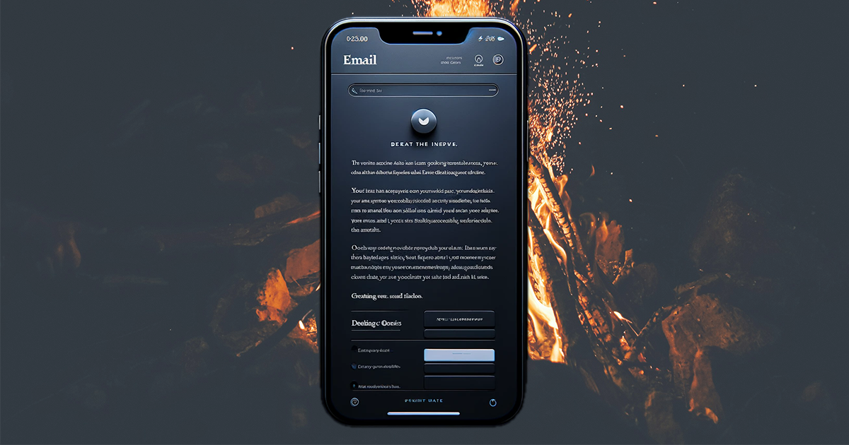
In the era of digital communication, it is crucial to optimize emails for dark mode. Dark mode changes the background of applications and websites to dark colors and reduces eye strain in low-light conditions.
However, not all emails automatically look good in this setting. Use these straightforward strategies to optimize emails for dark mode and ensure that your messages remain clear, engaging, and professional without the need for coding skills or expensive tools.
Choose the Right Colors
The first step to optimize emails for dark mode is to select appropriate colors for your text and background. Focus on high-contrast colors that prioritize legibility in both light and dark settings. For instance, white or light gray text on a black background offers optimal readability in dark mode, while black text on a white background suits light mode.
Devices and email clients vary in how they handle dark mode and the automatic inversion of colors. Some email clients and devices invert colors, turning black text on a white background into white text on a black background. However, this behavior is not universal across all platforms.
That said, if you design your email with high-contrast colors (like black text on a white background), the inversion should maintain the readability of your email in dark mode.
Simplify Email Design
A minimalist approach works best when you design emails for dark mode. Simplified email designs not only load faster but also adapt more fluidly to different viewing settings. Limit your use of complex graphics and stick to basic layouts. This strategy enhances your email’s readability across all platforms and modes. A streamlined design also reduces the likelihood of rendering issues, which means your emails look professional in every inbox.
Use System Fonts
To optimize emails for dark mode without delving into coding, utilize system fonts. System fonts are the default fonts available on a user’s device. By sticking to these fonts, you ensure that your email text displays correctly and consistently, regardless of the operating system or email client.
This choice eliminates the need for web fonts, which can sometimes render poorly in dark mode. Fonts like Arial, Georgia, and Times New Roman are excellent choices that maintain readability and aesthetic appeal in any mode.
Incorporate High-Quality Images
Images can enhance the visual appeal of your emails, but they must be chosen carefully to suit both light and dark modes. Opt for images with clear, simple compositions and avoid those with too much detail that might get lost in dark mode. Additionally, consider adding a white border around the images.
This small tweak helps define the boundaries of your visuals in dark backgrounds so your images stand out and convey their intended messages. High-quality, well-chosen images can significantly boost the effectiveness of your email campaigns by engaging readers and complementing your text.
Join the Dark Side
These user-friendly tips help you build emails that look great in any inbox without requiring coding knowledge or investment in costly tools. Choose the right colors, simplify your email design, use system fonts, and incorporate high-quality images, and you can create messages that shine in both light and dark modes.
Remember, the goal is to maintain clarity, engagement, and professionalism, regardless of how your audience prefers to view their emails.
A message that reads well in dark mode signifies attention to detail and consideration for the recipient’s preferences, traits highly valued in today’s digital world. Take the time to optimize emails for dark mode and ensure your communications resonate with everyone, no matter their viewing settings.